Patty Bun is a fast food brand that serve tasty yet healthy burgers, sandwiches.
Patty Bun is the to-go option for people who are looking for yummy bites but, they are also conscious about their health since it's known that good-tasting food is junk high in calories, fat, and sugar. A brand that was born to break eating patterns and challenge the idea that fast food cannot be healthy.
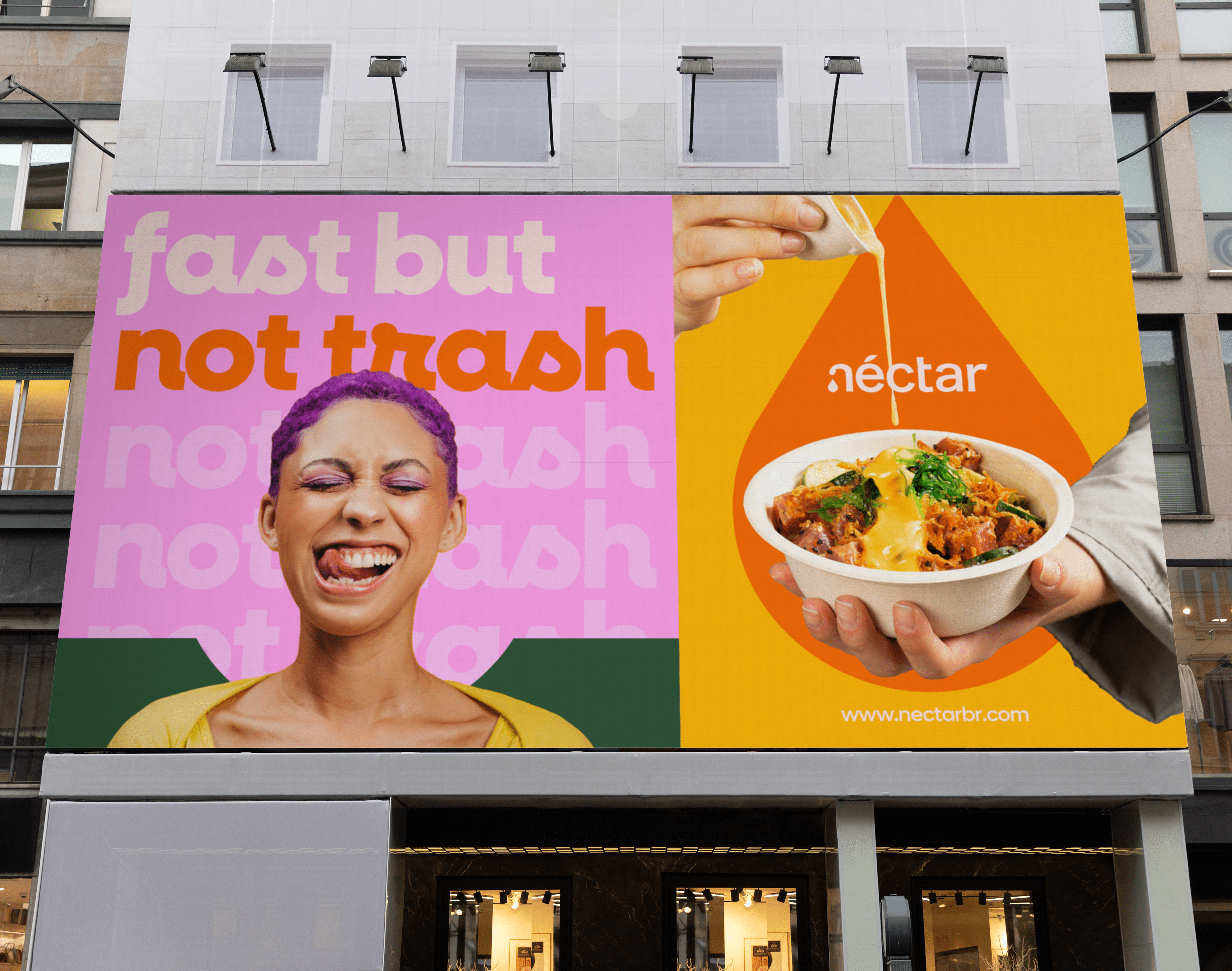
The creation of the brand’s tone of voice had the objective of making people feel happy and have good moments without a hint of guilt, eating healthy tasty Patty Buns! The brand speaks to youth and gen-z mainly in a playful, funny, warm inviting way, with expressions that melt in the mouth and make people fall in love with each bite.
This strategy of branding can organically generate more shares and instagrammable moments whether you're at our restaurant or enjoying Patty Bun delivered straight to your door, tasty moments will find a way!


The design process was an exciting exploration of organic shapes, colors, and typography. Drawing inspiration from the food itself, I crafted a dynamic logo that instantly grabs attention with a smile and communicates our brand's playful personality. Bold typography and hand-drawn illustrations further enhance the visual impact, inviting customers to dive into the Patty Bun experience.
Packaging is designed to be wrapped with stickers that usually tell a bit about what's inside or specify any customization and order preferences made previously, while it can also add an extra layer of delight and engagement to the brand.
Packaging is designed to be wrapped with stickers that usually tell a bit about what's inside or specify any customization and order preferences made previously, while it can also add an extra layer of delight and engagement to the brand.


